
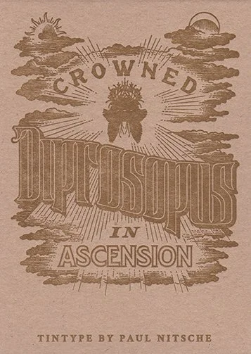
With the help of Nesja Press, I’ve made a letterpress certificate to go with my upcoming tintype edition, Crowned Diprosopus in Ascension. Due to the differences in reduction percentages, the main type was hand drawn separately from the central pen and ink illustration and were integrated together digitally.

The pencil drawing for the E in CROWNED.
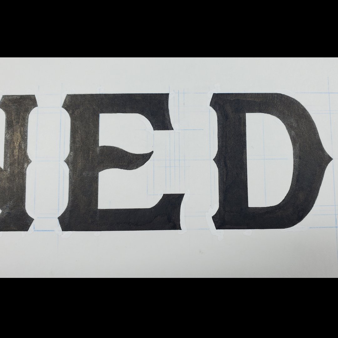
The letters for the word CROWNED were drawn separately and then placed on a curve in the final illustration.

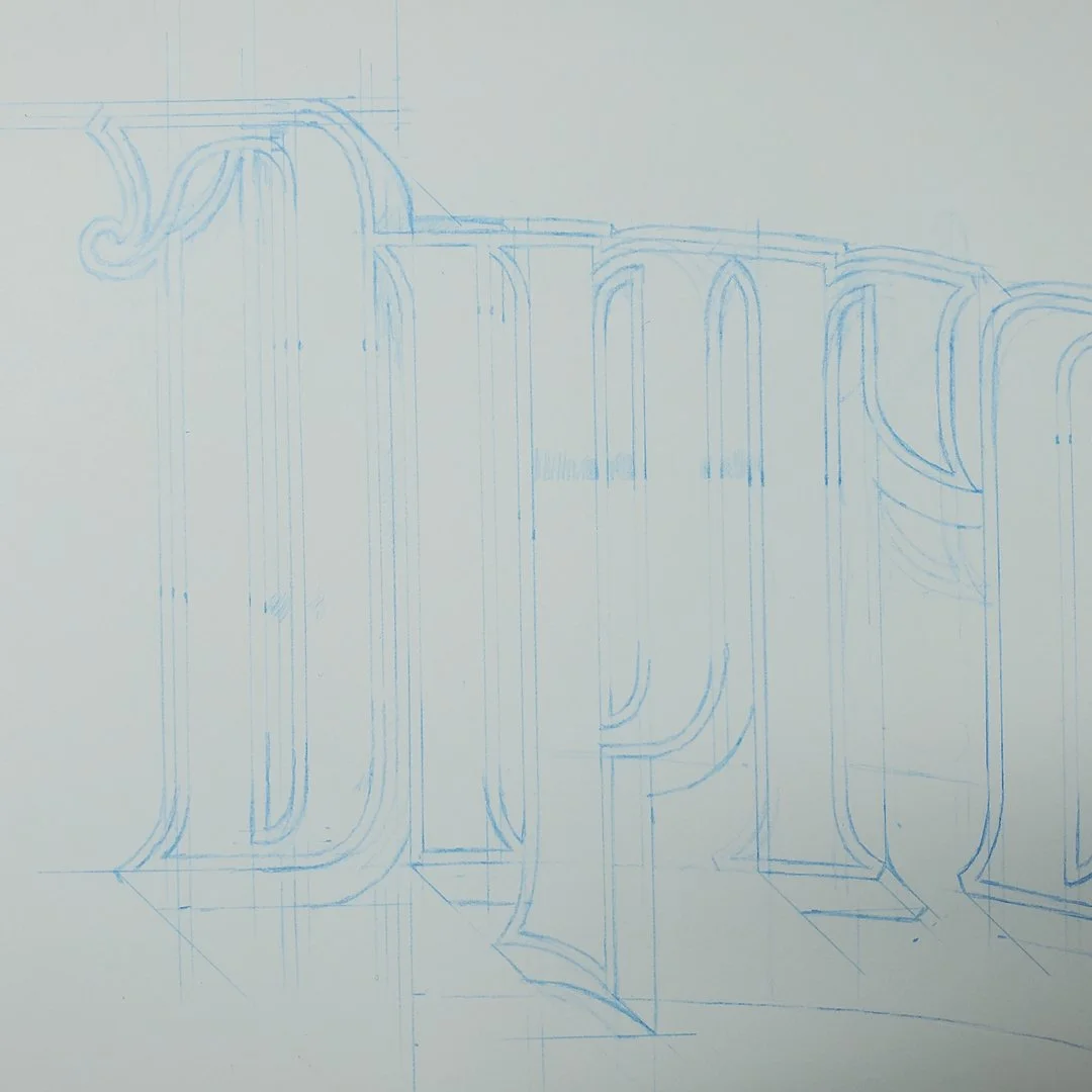
The word DIPROSOPUS was drawn in blue pencil before inking.
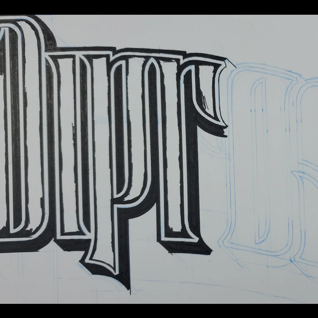
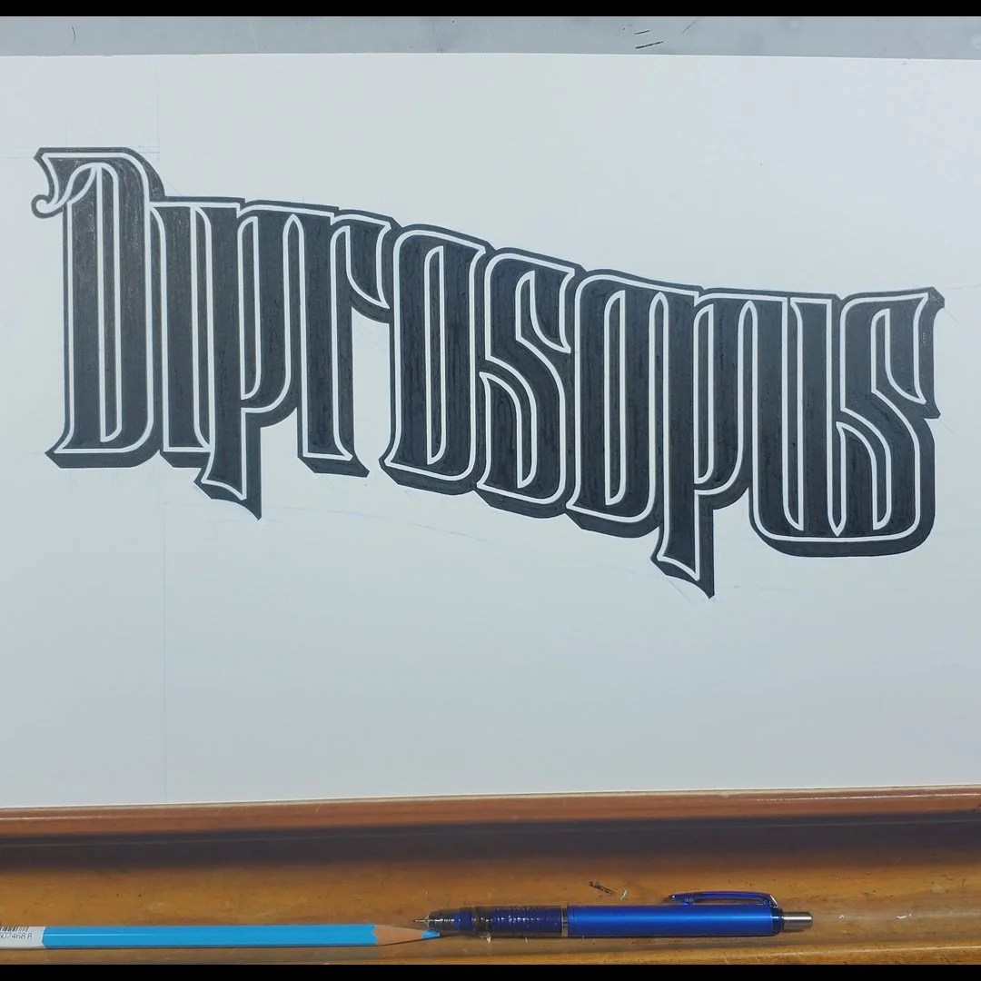
The finished inked word DIPROSOPUS.
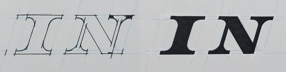
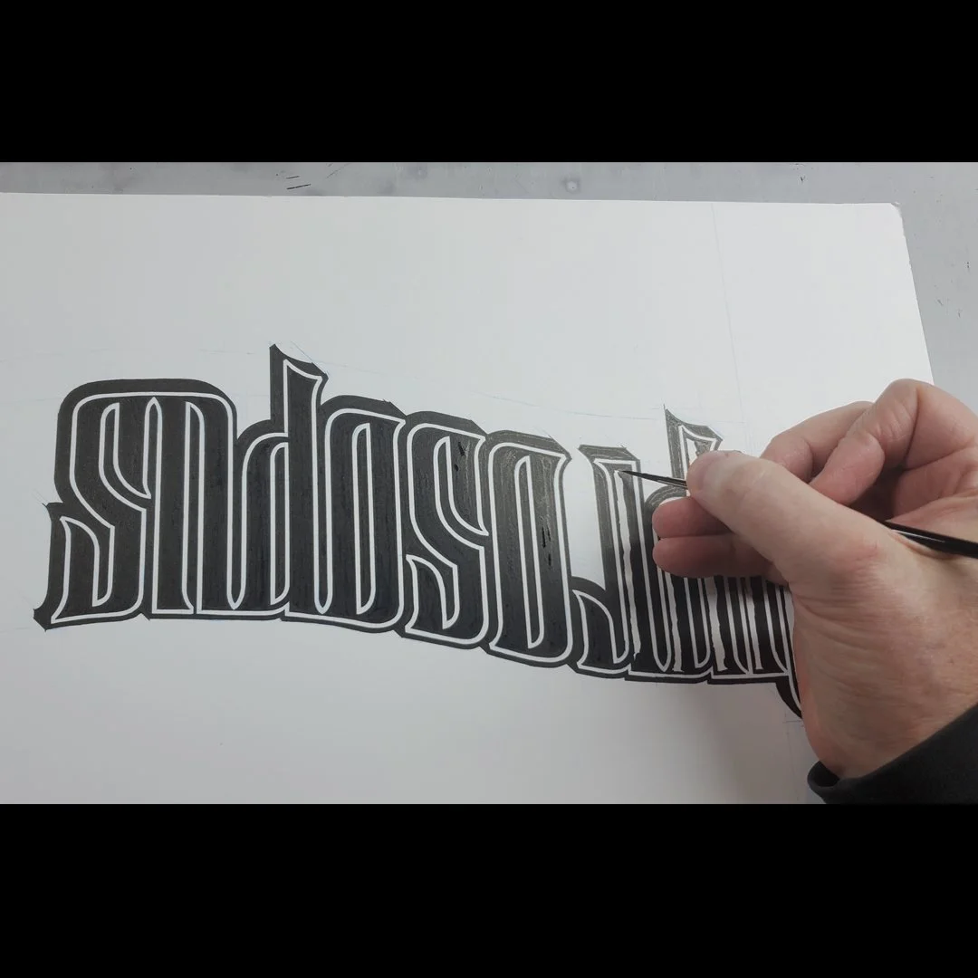
Inking the word IN. I always overshoot the line work and then sharpen the corners with whiting.

The inked work ASCENSION. I later slightly closed the spacing of the A and S digitally.


The pen and ink drawing for the certificate.
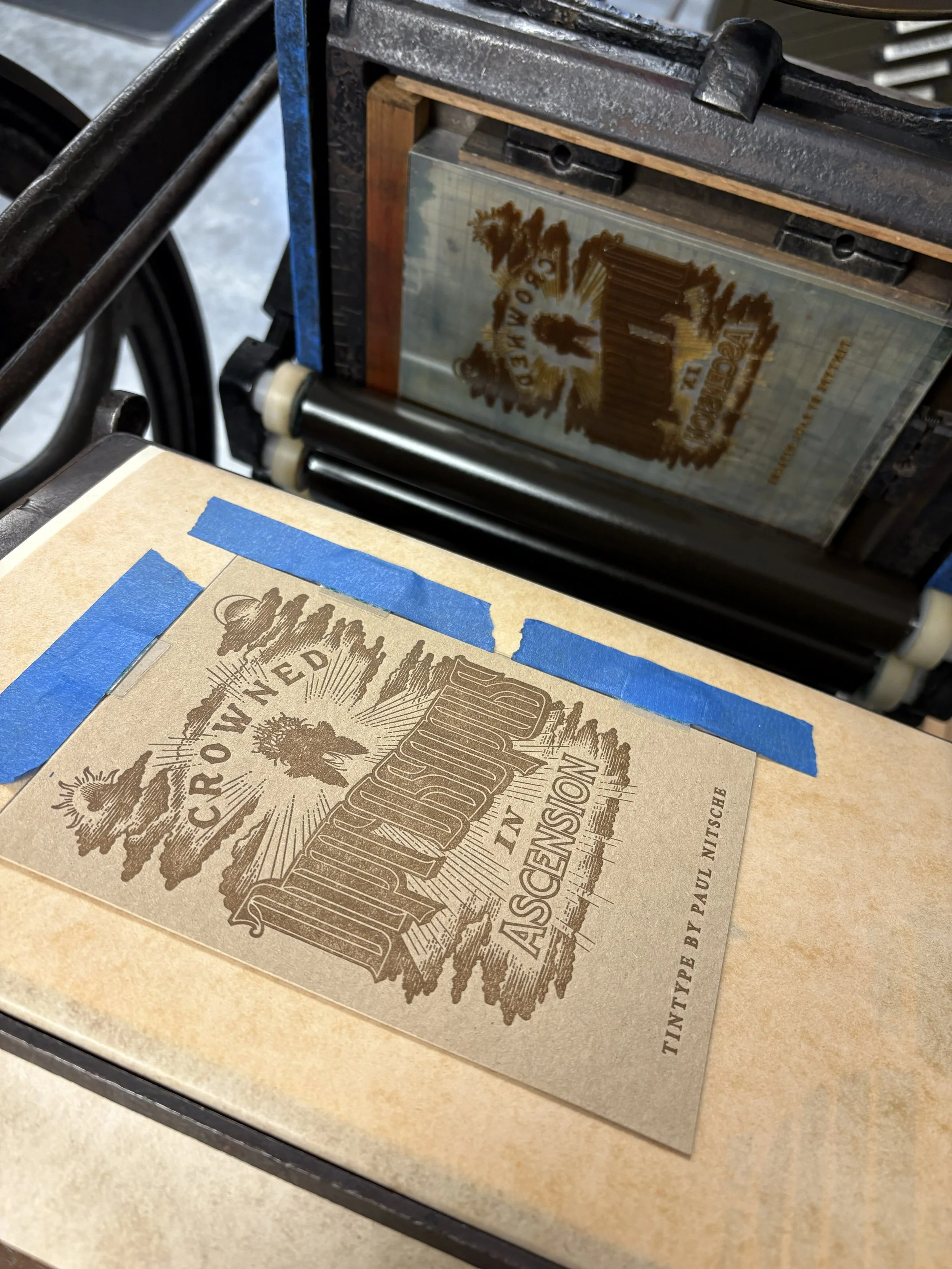
Through Nesja Press, a letterpress plate was made. The certificate was printed in brown ink on a very thick Sable Gmund Les Naturals 600 weight paper on a letterpress from circa 1890.

Video courtesy of Nesja Press.
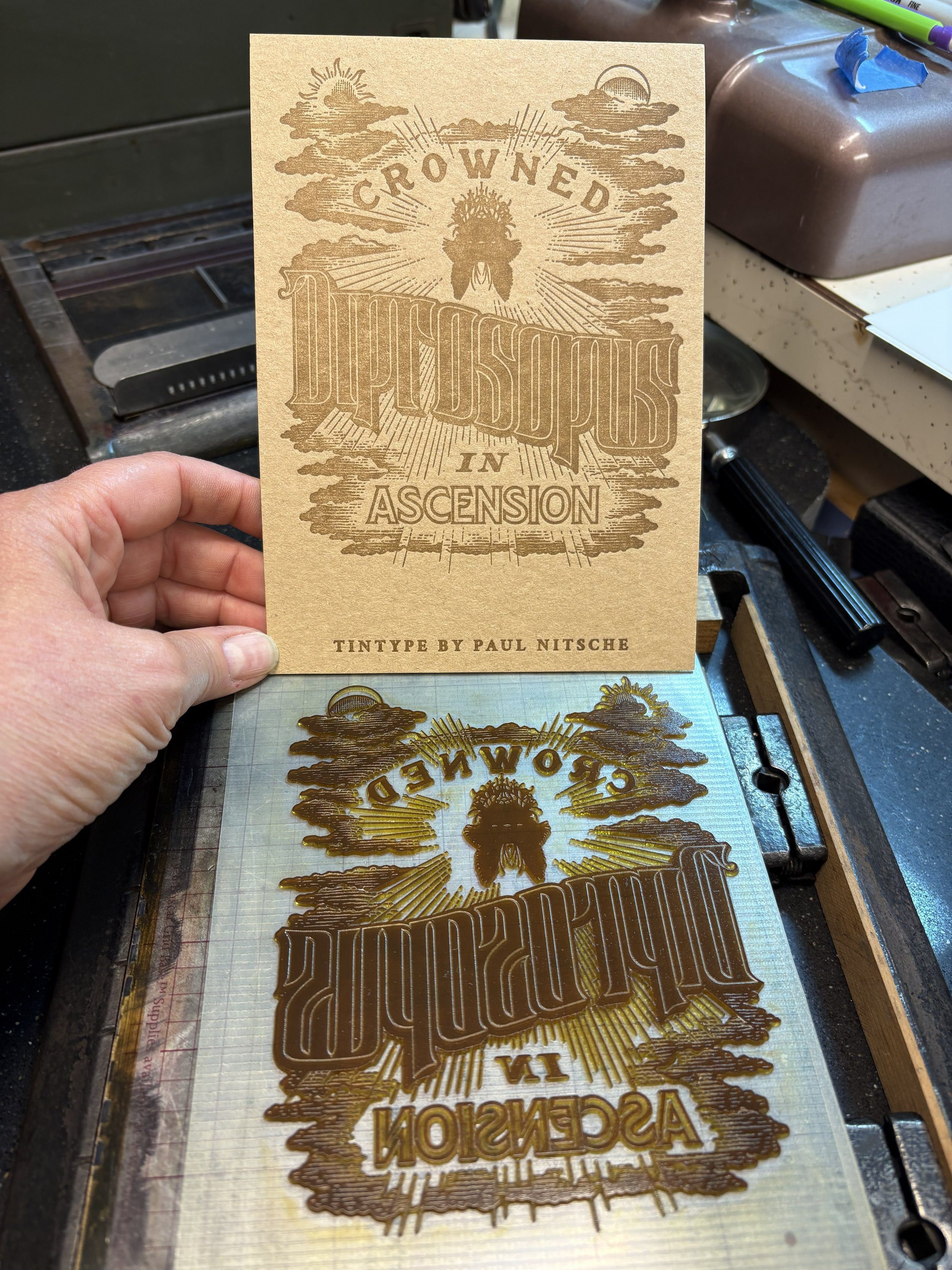

The finished certificate before signing and numbering.
A big thank you to Christy and Paul Nesja of Nesja Press.